31. Python - Plotting
December 24, 2018
home
Contents
01. package: matplotlib.pyplot, method: plot, data: two python lists
test setup
- install python 3, pandas, ... with anaconda3
- mac, code visual studio
- create a folder, 01_lines
- add a file, test.py
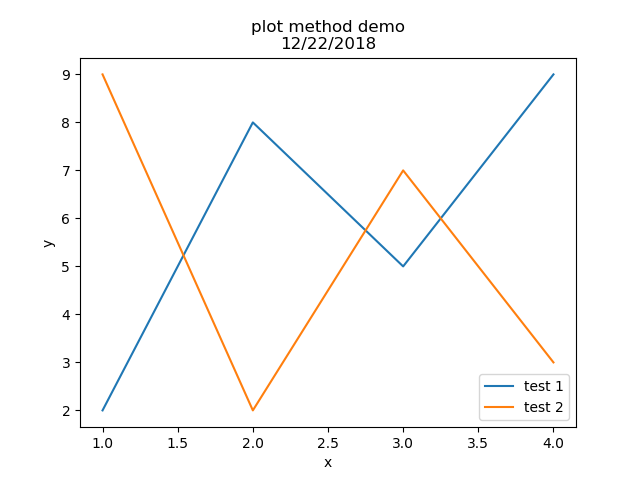
       import matplotlib.pyplot
       plt.plot([1,2,3,4],[2,8,5,9], label="test 1")
       plt.plot([1,2,3,4],[9,2,7,3], label="test 2")

       plt.xlabel("x")
       plt.ylabel("y")
       plt.title("plot method demo\n12/22/2018")
       plt.legend()

       plt.savefig("01_lines/two_lines.png")
code review
- The method draws lines
- The first list is the x-coordinates for 4 points.
- The second list is the y-coordinates for 4 points.
- The method builds the graphics in background.
- Method savefig creates a image file for rendering.
- No pandas, no dataframe is involved
01x. one pandas dataframe
introduction
- The previous topic uses hard coded data.
- Using csv files for data is more realistic.
- Module pandas provides dataframe type.
- Both module python and pandas are built upon module numpy.
- Using numpy, the efficiency is high. Because there is no label-like variables, very static.
steps
- in code visual studio
- Under the working folder, 01_lines, create a file, xy32.txt as below
1,2
2,8
3,5
- One row stands for one point - x, y.
- create a python file as below
        import pandas as pd
        data = pd.read_csv('01_lines/xy32.txt', names =["x", "y"])
        v = data.values
        t = v.transpose()          #[[1 2 3], [2 8 5]]
        x = t[0]                   #[1 2 3]
        y = t[1]                   #[2 8 5]

        import matplotlib.pyplot as plt
        plt.plot(x,y)
        plt.savefig("01_lines/lines11.png")
code analysis
- create a csv file from a txt file
- Argument names for columns are needed, otherwise, the 1st row will be used for column names
- v = data.values removes column names and row names.
- v.transpose() swaps rows and columns.
Other approaches
- In the text file, one row for the x-coordinates for these three points.
- The other row for the y-coordinates for these three points.
- There are two rows only. No transpose is needed
- The text file can be stored in a remote web site.
It can be accessed with HTTP protocal.
Use the same method, like pd.read_csv('http://....',...)
one scenario example to use plot method
- There are two column variables involved.
- A chicken growing scenario is as below:
- The data for x can be months.
- The data for y can be the weight sum of a group of chicken.
- Lines are drawn between days continuously.
- That's the way to monitor the chicken weight growth.
- Two tests are for different foods.
02. bar chart
- the senario to use bar.
- stock prices in y-coordinate
- stock names in x-coordinate
- the bar in green for its start price.
- the bar in green for its end price.
- In x, stocks are discrete, not continuous.
- Six lists must be prepared from some data source like csv for use.
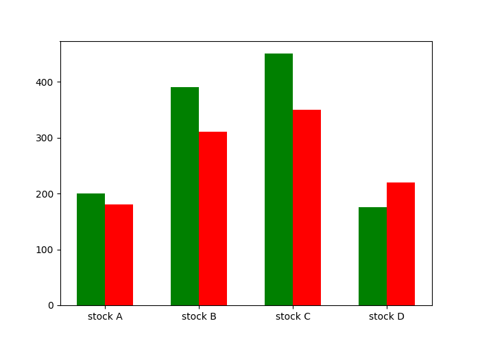
code as below:
        print("-----------   bar.py  --------------------")
        import matplotlib.pyplot as plt

        fig = plt.figure(figsize=(7,5))

        names = ["stock A", "stock B", "stock C", "stock D"]
        price1 = [200, 390, 450, 175]
        price2 = [180, 310, 350, 220]
        positions1 = [0,    1,    2,    3]
        positions2 = [0.3,  1.3,  2.3,  3.3]
        positions3 = [0.15, 1.15, 2.15, 3.15]

        plt.bar(positions1,  price1,  width=0.3, color="g", label="price 1")
        plt.bar(positions2,  price2,  width=0.3, color="r", label="price 2")

        plt.xticks(positions3, names)
        plt.legend()

        plt.savefig("02_bar/bar.png")

        print("---------  end of test 1 -------")
03. Histogram
- A histogram graphics LOOKS LIKE a bar graphics. THEY ARE VERY DIFFERENT ANIMALS.
- In this example, there are 80 weight data
- Based on the data, create bins for different age range, like 0-20, 20-40,.. 180-200.
- Use hist method to create a distribution graphics.
- In x, weight ranges are continuous, not discrete.
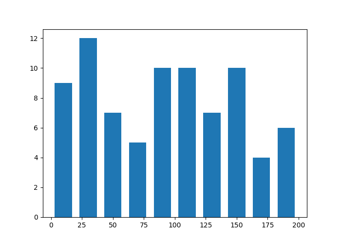
code as below:
        print("-----------   hist.py  --------------------")
        import matplotlib.pyplot as plt
        fig = plt.figure(figsize=(7,5))

        # prepare data from simulation, 80 weight data from 0 to 200
        import random
        all_weight = []
        for i in range(80):
            w = random.randint(0,200)
            all_weight.append(w)
        print(all_weight)

        # create bins based on the data
        bins = [0,20,40,60,80,100,120,140,160,180,200]

        plt.hist(all_weight, bins, histtype='bar', rwidth=0.7)

        plt.savefig("03_histogram/hist.png")     # see the weight distribution
        print("---------  end of test 4 -------
04. Scatter Graphics
- You'll see many dot dot dot
- This is the style for determine the correlation between two variables.
- There are three types of correlations
- Positive: as one variable increases so does the other.
- Negative Correlation: as one variable increases, the other decreases.
- none
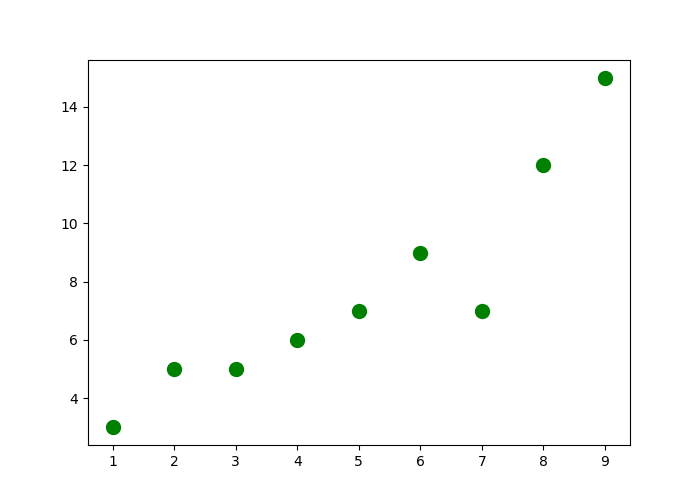
code as below:
        print("-----------   scatter.py  --------------------")
        import matplotlib.pyplot as plt
        fig = plt.figure(figsize=(7,5))

        x = [1,2,3,4,5,6,7,8,9]
        y = [3,5,5,6,7,9,7,12,15]
        plt.scatter(x, y, color='g', s=100, marker="o")

        plt.savefig("04_scatter/scatter.png")
        print("---------  end of test 2 -------")
05. stackplot graphics
- In this scenario, the group is weekdays.
- It has 7 elements.
- Each day element has 4 parts - working, tv, eating, sleep.
- You can see the time usages.
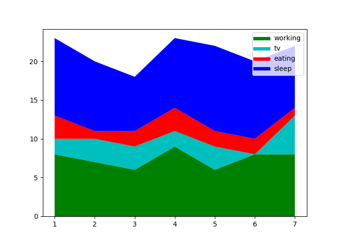
code as below:
        print("-----------   05_stackplot.py  --------------------")
        import matplotlib.pyplot as plt
        fig = plt.figure(figsize=(7,5))

        # group data for x-coordinate
        weekdays = [1, 2, 3, 4, 5, 6, 7]      # x-coordinate

        # parts data for y-coordinate
        working  = [8, 7, 6, 9, 6, 8, 8]      # part 1
        tv       = [2, 3, 3, 2, 3, 0, 5]      # part 2
        eating   = [3, 1, 2, 3, 2, 2, 1]      # part 3
        sleep    = [10,9, 7, 9,11, 10,8]      # part 4

        # for legend
        plt.plot([],[],color='g', label='working', linewidth=5)
        plt.plot([],[],color='c', label='tv',      linewidth=5)
        plt.plot([],[],color='r', label='eating',  linewidth=5)
        plt.plot([],[],color='b', label='sleep',   linewidth=5)

        # creating graphics
        plt.stackplot(weekdays, working, tv, eating, sleep, colors=('g','c','r','b'))
        plt.legend()

        # rendering graphics
        plt.show()
        #plt.savefig("stackplot.png")
        print("---------  end of test 2 -------")
06. pie graphics
- This scenario is about the cost analysis of a security projects.
- One list data is for all the cost elements.
- Another list is for their cost weights.
- labels are for cost element names.
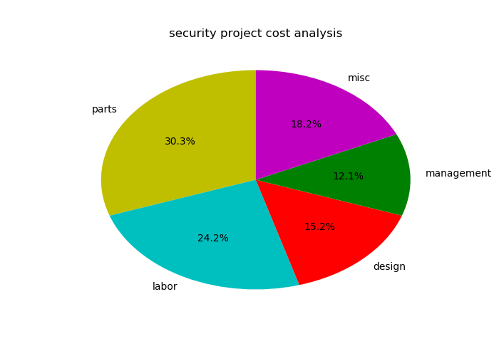
code as below:
        import matplotlib.pyplot as plt
        fig = plt.figure(figsize=(7,5))

        items   = ['parts', 'labor', 'design', 'management', 'misc']
        weights = [100,     80,      50,       40,           60    ]
        cols    = ['y',     'c',     'r',      'g',          'm']

        plt.pie(weights, labels=items,
                colors=cols, startangle=90, autopct='%1.1f%%')
        plt.title('security project cost analysis')

        plt.show()